Wednesday, 8 December 2010

Exhibition Final Piece

For the past few weeks, we have been creating a final piece for the recycling topic to go in the Maiden Erlegh peacock gallery.  For my final piece I created a collage on a wooden board, I used recycled materials and news paper headlines.

I was inspired to make this piece by the work of Tom Phillips; an artist who we had looked at earlier on in the topic.  Tom Phillips is famous for his work 'a Humument'.  In 'a Humument' Tom Phillips used a Victorian novel called 'a Human Document', he got rid of the 'an' from 'human' and 'doc' from 'document' to make the title 'a Humument'.  On every page he created a piece of art by covering the page by using different methods to make an appealing effect, through collaging, painting and drawing.  However, Tom Phillips would always leave some of the text showing through to make new sentences and words out of the old words from the original book.
Here are some examples of his work:


To get the idea of my final piece I thought of Tom Phillips, as I remember liking his work.  I originally planned to use his technique on a few pages of a magazine, however I changed it to make it more unique.  I
had a square piece of wood, and stuck various newspaper headlines onto the wood.  Then I collaged on pictures of the headlines (like Tom Phillips did with the uncovered words showing through) with square pieces of old leaflets.
I also made a maquette (a small model of the planned end result; to give and idea of what the finished piece will be like.  This gave me more confidence about my idea because it was more effective than I had expected it to have been; I wasn't sure whether the way I used small squares for the collaging would be effective.

Here is how I made my work in more detail:

  1. I got a square of wood, about 50cm x 50cm, then covered one face and the sides in newspaper by glueing it on.
  2. I looked through newspapers, looking for bold headlines I would be able to make an image through collaging from.  I tried to keep some of the headlines related to recycling; for example one of the phrases was 'what are you throwing away?'.
  3.  I stuck the headlines onto the wooden board.
  4. Next I cut up relevant colours from the old leaflets that I had.
  5. I collaged onto the wooden board images of the headlines; for example where I stuck on the word 'train' I collaged on a picture of an old-fashioned red steam train.  I also linked some of the images together; I wrote 'what are you throwing away?' coming out of the train's funnel.
I originally planned to make some of the collage on the board 3D, however when it was on a vertical wall I figured that I couldn't properly connect the 3D part onto the board.  

Overall, I was pleased with the end result, I was surprised at the resemblance between my own work and the work of Tom Phillips.  If I could improve my work then I would have tried to make what the collaged images were meant to be, and perhaps some of the collage wasn't completely stuck down to perfection.


Tuesday, 12 October 2010

Relief Form

Recently we have been studying the unique artwork of Cara Barer, in more detail. Cara Barer is a photographer who uses old books in her art.  The specific type of her work we are looking at is her photographs of 'wet'-books.  Here are some examples of the work we have been inspired from:


'Whirlgig' by Cara Barer

Cara Barer's artwork is very original and her work is very unique and distinctive.  The black background that she mounts most of her sculptures on is very effective; when I look at some of her work, it can be imagined floating through space, or wildly waving about underwater with the pages spread about in all directions.  There are many variations, so the viewer is left to decide the setting for themselves.


'New Century' by Cara Barer

     This was made out of a hard backed book, and that makes the piece look different to some of her other work, because the book cover stays straight.

     Now the piece looks like a women in a red cloak; and her hair is billowing out in all directions; which again might be because of being underwater, or there is a lot of wind.


Cara Barer thought of this style when she saw a yellow pages telephone book in the rain, and noticed the way the pages had moved, she photographed it, and then decided to make her own.  She started with dictionaries and then moved onto books.  She studies the books she uses very carefully, and said  “Because of the fact that I must begin thinking about handling the book as sculpture first, I am very attracted to its physical properties—the size, the quality of the paper, whether or not it has only text—is there any colour?”.  She usually soaks her book for hours and uses things such as hair rollers and Velcro to position and curl the pages.

How I made my version of Cara Barer's unique work


Equipment and materials that I used:

  • 1/4 of a thick magazine (it should have the thickness of the whole magazine, only cut into 4 rows horizontally from the spine).
  • Strong PVA glue.
  • About 20 paper clips (you might need more) 


Here is how I did it:

  • Step 1:  First find the spine of your magazine and bend it vertically down the middle to make it more flexible.  
  • Step 2:  Once you have done that, get two or three pages at a time and bend them into loops, and secure them with paper clips. 
  • Step 3:  Repeat step two, putting the pages into loops similar to the way Cara Barer does it, until all of your pages have been used up.
  • Step 4:  Now you need to replace the paper clips with glue.  One at a time, take off a paper clip and where the paper clip was put some glue.  Make sure to put plenty of glue on or the pages won't stick and will become loose.

My final piece was successful as it was able to stand on its own without the use of paper clips.  The technique of using paper clips was effective, but it was difficult because the glue took a long time to stick.  Also, getting the right shape for the loops was difficult as well; I was trying to do more raindrop shaped loops, but they usually came out as circles.

Monday, 11 October 2010

Recycled Paper Flower Making

Here I am going to tell you how to create two different types of flowers, made with recycled materials.

Flower Number One:

The first flower is the bigger type of the two.  You will need about 10 or 11 double sheets of newspaper, about 3 double pages of a magazine, a pair of scissors and a small amount of masking tape.

  • Step 1:  Lay out 5 sheets of newspaper on top of each other (vertically), but so that their actual height is about 65 cm.  Then lay the remaining newspapers on top to strengthen it.
  • Step 2:  Roll the sheets of newspaper up (still together) from the corner (rolling diagonally across), trim the weak ends off, so you get a pole of newspapers about 70cm tall.  Then secure it with masking tape.
  • Step 3:  With your magazine sheets, cut horizontally towards the centre all the way along.  Stop cutting about 3cm away from the spine, and have the cut about 2cm-3cm away from each other, so you form strips.
  • Step 4:  Attach the cut magazine onto the top of the newspaper pole, and attach it with masking tap.  Make it secure so the the strips are facing up, but then let them bend down.  If you wish, then attach more cut magazines further down.  And that is your flower finished!.

Flower Number Two

This flower is smaller than the previous one, and is again made of recycled materials.

Materials and equipment you will need:

  • One double page from a magazine (preferably the cover because it will provide more strength, but it doesn't have to be).
  • A small amount of masking tape.
  • A pencil.
  • A pair of scissors. 
  • 6 strips of cardboard; all about 1cm wide, then a mix of 20cm and 35cm in length.
Step 1:  Similar to the first flower, roll up your magazine cover, starting from a corner (rolling diagonally across the page).  To start the rolling, place the pencil on the corner and roll around that, because the thickness of a pencil is the recommended thickness of this flower.  Then make sure it doesn't unravel by securing a piece of masking tape. 

Step 2:  Get your cardboard strips, and start rolling them around the pencil so they create spirals, but make sure you leave about 5cm at the end.

Step 3:  Once you have you rolled up your strips, insert them into the top of the magazine tube.  Try to vary the lengths and spiral sizes.

Clay Demonstration

Here I am going to tell you how to make a mould for bottle slumping in a kiln.  Bottle slumping is when glass bottles (preferably wine bottles, because they are a good size) are put inside a kiln until they start to 'slump'.  They are very decorative and practical and they have many uses, such as trays for food, and are also very good looking and decorative.


A decorative slumped wine bottle


These are the materials and equipment for making the mould:
  • Clay ( in a plastic consistency state)
  • A Clay mat
  • A few paper towels and a bit of masking tape
  • A rolling pin
  • A knife (it doesn't have to be sharp) and fork
  • A beaker of water
  • A wine bottle
-----------------------------------------------------------------------------------------------------------
  • Step 1:  If you wish, take off the label- you might not want to however, and it isn't necessary because the label wont melt all over the bottle.  Cover your wine bottle simply around the main body with the paper towels and secure it with a small piece of masking tape.

  • Step 2:  Flatten the clay with your palm- EVENLY!.  Then use the rolling pin to make sure they thickness is 1cm all over, and use the rolling pin to help make it even.  Make sure both sides are flat. 


  • Step 3:  With your knife, cut around the clay to make it fit over about half of the bottle, then place the clay onto the bottle to make sure it fits.  Remember to roll all the edges pointing up, and that your bottle will slump roughly into the shape of your mould!


  • Step 4:  With the excess clay, make 4 small balls- these will act as the legs of the mould.  Once they are made, use your fork to cross hatch the bottom of the balls, and cross hatch the main frame of the mould in each corner.  Place each ball onto the main frame (make sure you put the cross hatched areas touching each other, and secure it with slip (a glue like substance which is a mixture of clay and water).


  • Step 5:  Wait for the mould to go bone dry (keeping the bottle in it).  Once the mould is bone dry then place it in the kiln at 1100 degrees Celsius.

Sunday, 3 October 2010

3D Projecting Form

This week in our art class we were creating 3D sculptures from books, which if weren't used would have been thrown out.  However, there was a twist.  Our sculpture had to be based on what our book was about; for example my book was about ancient Egypt and "Tutankhamun and the valley of the kings", so I made a 3D pyramid and an Egyptian 'mummy'.

Here are some artists' work that my work links to:

I haven't yet found out the name of the artist of this 3D sculpture, but I think that the book is 'Alice in wonderland', and a table has been made, similar to the one on the opposite page.  This links to our sculptures because you can see that the sculpture on this book was based on the picture on the opposite page.


This piece is called 'Billy Goat the Counsellor', by Sachiyo Yoshida.
Unfortunately I obviously cant't tell what this book is about, but you can see that it is 3D, and popping up, out of the book


Wednesday, 22 September 2010

2D Flip Art

On the 16th and 17th of September in our art class, we were given a task of making 2D flip art with books which otherwise would be going in the bin.  We had to base our flip art on what the book was about, by reading the synopsis or a few paragraphs from the book. We based our work on artists such as Sachio Yoshida and Ross Rixon, other artists who often use books in their artwork.

These are some pieces of what we based our work on:


     I don't know who the artist is, but it's a very good finished piece.  The background is very simple, but that doesn't matter because it works well with another simple, but mysterious, women walking in the forest.  The women looks as if she is doing something, and as the viewer you want to know more and that is what makes it so appealing.


     I think that this book was a romantic novel.  There are a man and a women, who are holding there hands out towards each other, because they love each other.  They are also on opposite sides of the page to one another, which suggests to me that they are being kept apart.


Our task:

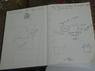
First of all we got a book.  The one I used was called "The Penguin's Guide To The Law".  I thought this was a very boring book, and found it hard to think of ideas I could base my flip art on.  Then once we had our books, we found the middle of it and stuck 4 or 5 pages together on either side, to make the page we would make our flip art on stronger, and left it to dry.  We then read some of the book or the synopsis and decided to think about what we could make for our pop art (it had to be to do with the book).  We made notes on the blank pages at the front and back of the book:
These are some of the notes I made.


After some thinking, I decided that I would make a court scene; there would be a penguin as the judge at the back of the scene, and at the front the would be a silhouetted jury.

After that we started to draw our designs onto our books, then cut them out with a craft knife.  It was important that we made sure we had a cutting mat underneath the page we were cutting on; so the other pages below the one we were cutting on wouldn't get damaged.


Unfortunately I only had the time to do one pop up on my book, but overall, from what I did it was successful.  The pop up was stiff and didn't fall back down, and it was quite clear, because I was going to make a full court scene if I had had the time.  I could have spent more time on how I could distinguish the fact that it was a penguin, perhaps thinking more about what makes a penguin a penguin- exaggerating key features like its beak.  Maybe creating another penguin next to it, because it would be easier to make it look like a penguin if it wasn't behind the stand.

Wednesday, 15 September 2010

Introduction

Welcome to my blog.  I am a year nine student, and at our school we are making art sculptures through recycling for this term.  This means that all of the work we will be doing will be made of used items, such as old newspapers and magazines.  Our final aim is to produce a piece to go onto display in our schools art gallery.

My blog gives a  new, artier understanding of the 3 Rs of Recycling; they are:

Rework
Rearrange to
Reinvent

Recently we have been studying 'book art'.  Book art is when old books are used to create a piece of art.  Often these books would be thrown out it not used for the artwork, which is why we are studying book art in the recycling topic.

We have briefly looked at several artists who use books in their art work.

Robert The


     In lots of his work, he uses a laser cutter to cut shapes out of old books.  When making a shape, a scorpion in this example, Robert The will usually cut out from the spine, this makes his work symmetrical, and keeps the pages held together and makes it look more professional.
     This piece is one of my favourite out of the examples on this post, because I am inspired by the creativity.  Robert The has turned a very boring book cover into a very imaginative piece of artwork.  It's very simple, but I think it's very effective.  Even the way that he left the original book on show, improves my opinion of it.


Sachiyo Yoshida
     I am not so sure if I like this sculpture.  To me it looks a bit plain and simple.  Robert The's art was simple as well, but his was very original, which drew you towards it.  However this piece to me, just looks like a pile of book and isn't that amazing.  This piece doesn't have any features that make it stand out as a clever piece of book art.


Georgia Russel


     Some of this piece is very good and shows a lot of skill; like the book and the way it has been so delicately cut out.          
     
     However, similar to the previous piece, this piece seems to be very mysterious.  It looks as if the bright book is being swallowed up by the plain strips of paper behind it; and this makes it feel quite gloomy and miserable. 


Cara Barer
     Cara Barer's style is very original and unique, and her work is probably the most distinct as to who created it out of the four artists on this post.

     The black background which she has on most of her pieces is very effective; when I look at her work on a black background, I imagine it floating through space; or under water with the pages spreading out in all directions.  There are many variations and you can make up your own personal choice about where the background is.