Wednesday 22 September 2010

2D Flip Art

On the 16th and 17th of September in our art class, we were given a task of making 2D flip art with books which otherwise would be going in the bin.  We had to base our flip art on what the book was about, by reading the synopsis or a few paragraphs from the book. We based our work on artists such as Sachio Yoshida and Ross Rixon, other artists who often use books in their artwork.

These are some pieces of what we based our work on:


     I don't know who the artist is, but it's a very good finished piece.  The background is very simple, but that doesn't matter because it works well with another simple, but mysterious, women walking in the forest.  The women looks as if she is doing something, and as the viewer you want to know more and that is what makes it so appealing.


     I think that this book was a romantic novel.  There are a man and a women, who are holding there hands out towards each other, because they love each other.  They are also on opposite sides of the page to one another, which suggests to me that they are being kept apart.


Our task:

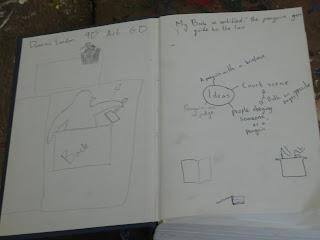
First of all we got a book.  The one I used was called "The Penguin's Guide To The Law".  I thought this was a very boring book, and found it hard to think of ideas I could base my flip art on.  Then once we had our books, we found the middle of it and stuck 4 or 5 pages together on either side, to make the page we would make our flip art on stronger, and left it to dry.  We then read some of the book or the synopsis and decided to think about what we could make for our pop art (it had to be to do with the book).  We made notes on the blank pages at the front and back of the book:
These are some of the notes I made.


After some thinking, I decided that I would make a court scene; there would be a penguin as the judge at the back of the scene, and at the front the would be a silhouetted jury.

After that we started to draw our designs onto our books, then cut them out with a craft knife.  It was important that we made sure we had a cutting mat underneath the page we were cutting on; so the other pages below the one we were cutting on wouldn't get damaged.


Unfortunately I only had the time to do one pop up on my book, but overall, from what I did it was successful.  The pop up was stiff and didn't fall back down, and it was quite clear, because I was going to make a full court scene if I had had the time.  I could have spent more time on how I could distinguish the fact that it was a penguin, perhaps thinking more about what makes a penguin a penguin- exaggerating key features like its beak.  Maybe creating another penguin next to it, because it would be easier to make it look like a penguin if it wasn't behind the stand.

Wednesday 15 September 2010

Introduction

Welcome to my blog.  I am a year nine student, and at our school we are making art sculptures through recycling for this term.  This means that all of the work we will be doing will be made of used items, such as old newspapers and magazines.  Our final aim is to produce a piece to go onto display in our schools art gallery.

My blog gives a  new, artier understanding of the 3 Rs of Recycling; they are:

Rework
Rearrange to
Reinvent

Recently we have been studying 'book art'.  Book art is when old books are used to create a piece of art.  Often these books would be thrown out it not used for the artwork, which is why we are studying book art in the recycling topic.

We have briefly looked at several artists who use books in their art work.

Robert The


     In lots of his work, he uses a laser cutter to cut shapes out of old books.  When making a shape, a scorpion in this example, Robert The will usually cut out from the spine, this makes his work symmetrical, and keeps the pages held together and makes it look more professional.
     This piece is one of my favourite out of the examples on this post, because I am inspired by the creativity.  Robert The has turned a very boring book cover into a very imaginative piece of artwork.  It's very simple, but I think it's very effective.  Even the way that he left the original book on show, improves my opinion of it.


Sachiyo Yoshida
     I am not so sure if I like this sculpture.  To me it looks a bit plain and simple.  Robert The's art was simple as well, but his was very original, which drew you towards it.  However this piece to me, just looks like a pile of book and isn't that amazing.  This piece doesn't have any features that make it stand out as a clever piece of book art.


Georgia Russel


     Some of this piece is very good and shows a lot of skill; like the book and the way it has been so delicately cut out.          
     
     However, similar to the previous piece, this piece seems to be very mysterious.  It looks as if the bright book is being swallowed up by the plain strips of paper behind it; and this makes it feel quite gloomy and miserable. 


Cara Barer
     Cara Barer's style is very original and unique, and her work is probably the most distinct as to who created it out of the four artists on this post.

     The black background which she has on most of her pieces is very effective; when I look at her work on a black background, I imagine it floating through space; or under water with the pages spreading out in all directions.  There are many variations and you can make up your own personal choice about where the background is.